Customizing Login Page and Distribution Page
You can customize the login page and distribution page that are displayed when clients connect to the server.
The login page does not display when security is disabled. When a client connects to the server, the client will go directly to the distribution page.
Login Page Layout
You can customize title, slogan, node name, header picture and footer picture for the login page.
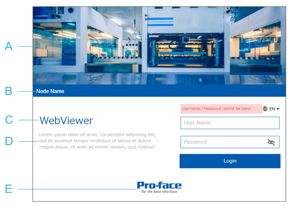
- Select the [Header Picture Visibility] check box and configure an image in [Header Picture]. If [Header Picture] is undefined, displays the default image.
- Configured in [Node Name]
- Configured in [Title]
- Configured in [Slogan]
- Select the [Footer Picture Visibility] check box and configure an image in [Footer Picture]. If [Footer Picture] is undefined, displays default image.
Settings
- In the Project Explorer window, go to [System Architecture] and click [Target01].
- In the Properties window, click [Advanced] tab and click [Data Access] tab.
Go to [Web Function Settings] ➞ [Web Viewer Settings] ➞ [Page Layout] and set the following properties:
PropertiesProperties[Header Picture Visibility] Select the check box to display either the image selected in the [Header Picture] property, or the default image (no image set in the [Header Picture] property).
[Header Picture] Click the ellipsis [...] and select a .png image file to display in the header of the Web Viewer login page.
The image must be less than 1 MB. When the image is inserted, its aspect ratio (ratio between width and height) is maintained to fit in the header.
If no image is selected, the header uses the default graphic.
[Node Name] Enter the name of the server to display on the Web Viewer login page. The node name appears at the bottom of the header.
Leave the [Node Name] blank to collapse that area in the login page.
The node name is also used as part of the Web browser title bar.
[Title] Enter a title to display on the Web Viewer login page.
Leave the [Title] blank to collapse that area in the login page.
The title also is also used as part of the Web browser title bar.
[Slogan] Enter a slogan that appears below the title on the Web Viewer login page.
Up to three lines of text can be displayed. Anything beyond three lines will be truncated with an ellipsis (...).
Leave the [Slogan] blank to collapse that area in the login page.
[Footer Picture Visibility] Select the check box to display either the image selected in the [Footer Picture] property, or the default image (no image set in the [Footer Picture] property).
[Footer Picture] Click the ellipsis [...] and select a .png image file to display in the footer of the Web Viewer login page.
The image must be less than 1 MB. When the image is inserted, its aspect ratio (ratio between width and height) is maintained to fit in the footer.
If no image is selected, the footer uses the default image.
Theme Color Settings
You can customize the theme color settings for the login page and distribution page.
Login Page
Distribution Page
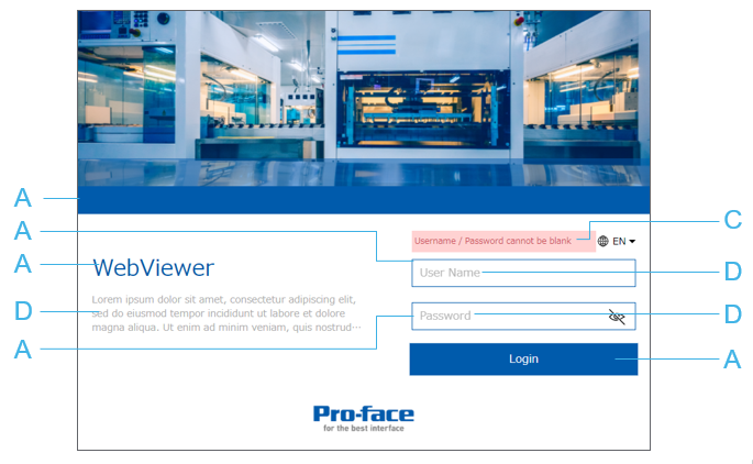
- Configured in [Primary]
- Configured in [Primary Variant]
- Configured in [Error]
- Configured in [Text]
You cannot specify specific colors such as the background color and text color of buttons. Appropriate colors are applied based on the selected [Primary] and [Primary Variant] colors.
Settings
- In the Project Explorer window, go to [System Architecture] and click [Target01].
- In the Properties window, click [Advanced] tab and click [Data Access] tab.
Go to [Web Viewer Settings] ➞ [Theme] ➞ [Main Colors] and [Functional Colors] and set the following properties:
PropertiesProperties