Configuring a Screen with Multiple Sections
You can create a screen similar to an application user interface with multiple adjustable window panes.
After switching the Display/Collapsed of layout objects with visibility animation, the content display object and switch object size and location will be automatically adjusted by the Dock Panel, and the pane display will change.
For information about the function used to configure a screen composed of multiple panes, refer to the following.
Operation When Visibility Animation is Set Up
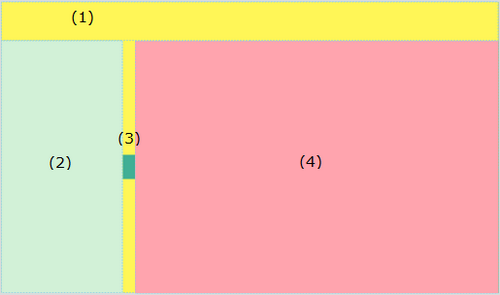
Example Operation
Touch the switch on the Dock Panel to collapse the layout object (left pane); the content display object (main pane) aligned thereafter will expand to fill that space. Touch the switch again to display the layout object.
Setting Workflow
Add Variables
Add a variable storing the [Visibility] property of the layout object.
Project Explorer: [Variables] → [All Variables]
Add the below variable(s).
;)
Variable Properties
[Name] |
[Data Type] |
| Var1 | [INT] |
Add Screen
Project Explorer: [Screen Design] → [Screens]
Add the below screen(s).
;)
Screen Properties
[ScreenID] |
[Screen Type] |
2 |
[Dock Panel] |
Project Explorer: [Screen Design] → [Screens] → [Screen2]
To define screen settings such as color, in the Document view, click the drawing area and define the settings in the properties window.
Dock Panel Properties
Tab |
Property |
Value |
||
[Basic] |
[Fill] |
[Color] |
[Value] |
ID:14 |
Project Explorer: [System Architecture] → [Target01]
Set the properties below.
Target01 properties
Tab |
Sub |
Property |
Value |
|
|---|---|---|---|---|
[Function] |
[Basic] |
[Preference] |
[Initial Screen ID] |
2 |
This property sets the screen configured in this setting example (Screen ID: 2) to be displayed first after starting the runtime.
Add Contents
Project Explorer: [Screen Design] → [Contents]
Add the below contents.
;)
Content Properties
[Content ID] |
[Screen Type] |
| 1 | [Scroll Canvas] |
Project Explorer: [Screen Design] → [Contents] → [Content1]
To define contents settings such as color, in the Document view, click the drawing area and define the settings in the Properties window.
When
designating colors with ID, the displayed colors will vary depending
on the [Color Set] in the [Tool Chest].
Color Set
Scroll Canvas Properties
Tab |
Property |
Value |
||
[Basic] |
[Fill] |
[Color] |
[Value] |
ID:25 |
Set Up Layout Objects/Parts
Project Explorer: [Screen Design] → [Screens] → [Screen2]
Drag and drop the following objects from the [Tool Chest] to the screen.
;)
The object alignment order can be changed with the [Object List].
- Layout Object - Canvas (Name: Canvas1)
- Layout Object - Stack Panel (Name: StackPanel1)
- Switch Object (Name: Switch1)
Content display (Name: ContentDisplay1)
When aligning objects, drag and drop them to the outside of the layout object or outside the screen area in order to keep them from overlapping. Note that when none of the objects on the screen are selected, they can also be aligned without overlapping by double-clicking the relevant object in the [Tool Chest].
Layout Object - Canvas (Name: Canvas1) Properties
Tab |
Property |
Value |
||
[Basic] |
[Location] |
[Dock] |
[Top] |
|
[Height] |
80 |
|||
[Fill] |
[Color] |
[Value] |
ID:14 |
|
Layout Object - Stack Panel (Name: StackPanel1) Properties
Tab |
Property |
Value |
||
[Basic] |
[Orientation] |
[Vertical] |
||
[Location] |
[Dock] |
[Left] | ||
[Width] |
250 |
|||
|---|---|---|---|---|
[Fill] |
[Color] |
[Value] |
ID:11 |
|
[Visibility] |
[Variable] [Name]: Var1 |
|||
Install
the accordion menu in the Stack Panel. For information about the accordion
menu, refer to the following.
Configuring an Accordion
Menu
Switch Object (Name: Switch1) Properties
This switch changes the pane display. When the switch is touched, the [Visibility] property of the Layout Object - Stack Panel (name: StackPanel1) is changed to 0 (Display) or 2 (Collapsed).
Tab |
Sub Tab |
Property |
Value |
Tab |
|---|---|---|---|---|
[Function] |
[Touch] |
[Operation] |
[Type] |
[Word] |
[Operation] |
[XOR] |
|||
[Source] |
2 |
|||
[Destination] |
[Variable] [Name]: Var1 |
|||
[Shape] |
[Size/Location] |
[Location] |
[Dock] |
[Left] |
[Width] |
25 |
|||
[Height] |
50 |
|||
Content Display (Name: ContentDisplay1) Properties
Tab |
Sub Tab |
Property |
Value |
|---|---|---|---|
[Function] |
[Basic] |
[Content ID] |
1 |